Oatey
Cornwall
Strategy, Brand & Copywriting
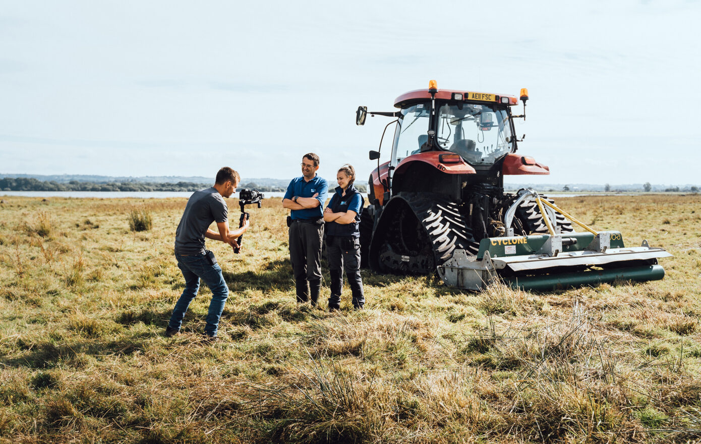
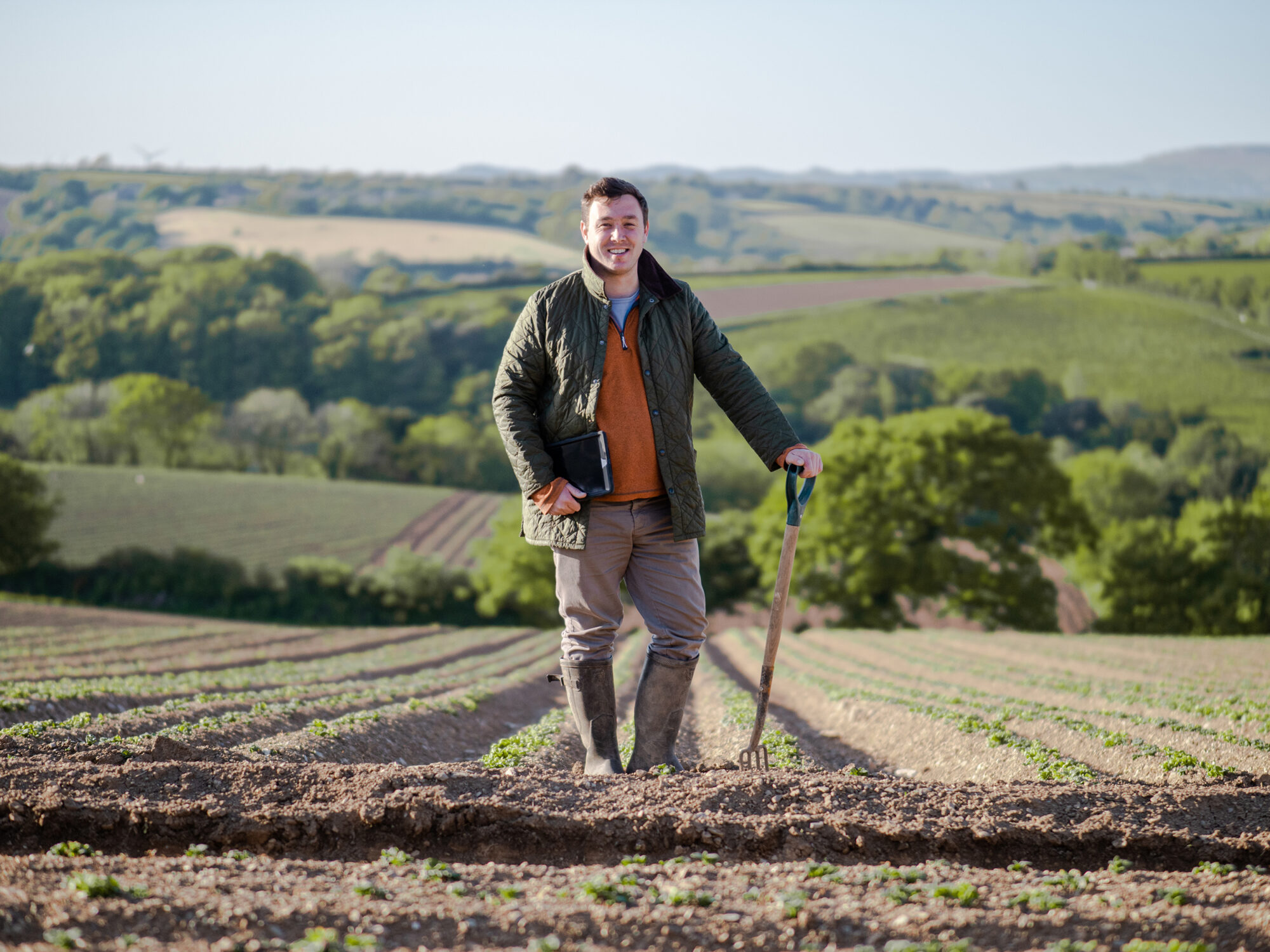
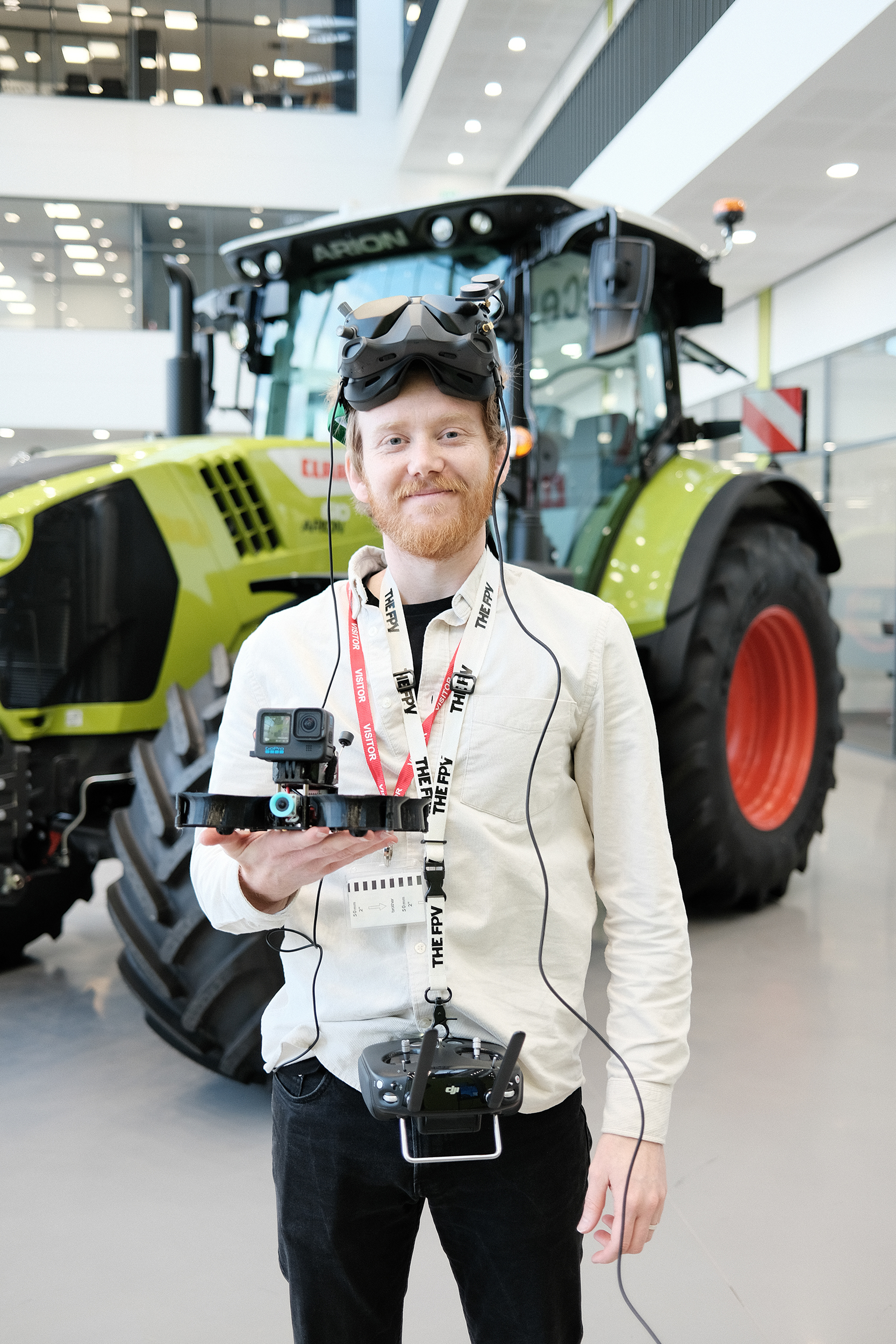
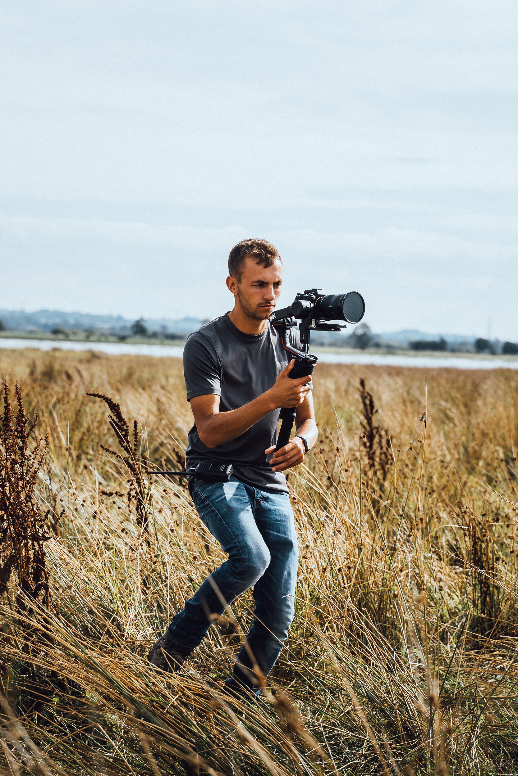
Almost a decade ago our paths collided with Sam Oatey, the creative mind behind Oatey Media. Growing up on a family farm in Cornwall, surrounded by enterprises that had grown out of the core agricultural activity, Sam’s passion and affinity for filmmaking gave rise to the launch of Oatey Media in 2011.
Like us, he was in the early stages of getting his business up and running and by chance, at an industry event we happened to be sat at the same table. In life when you meet someone new, you sort of know pretty instantaneously whether they are ‘your kind of people’. Sam was ‘our kind of people’!
Impressive, curious, passionate, and super funny to boot, we just knew that as soon as the opportunity arose to commission some film making for a client, Sam and his team at Oatey Media were the company we’d be getting in contact with.
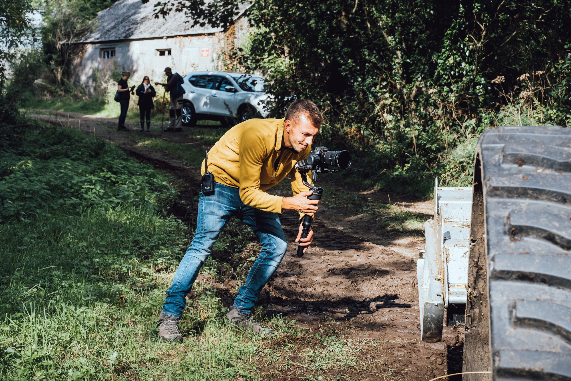
Fast forward a number of years and we’ve had the pleasure of collaborating several times with the team at Oatey, this confirmed our original sentiments that the distinctive films they produce are wonderfully crafted and of the very highest quality. Conversations between us often gravitated towards their brand identity.
Then, in 2023, as Oatey Media’s footprint expanded across the UK and Europe, the need for a brand uplift became unmistakable. An opportunity arose for us to reciprocate Sam’s creative energy – an opportunity to shape and elevate the Oatey brand narrative.
Our journey began with immersive strategy sessions, peeling back the layers of the brand. We carefully crafted key messages and brand muses, anchoring our design in both strategy and aesthetics. Oatey aimed for refinement, not a radical shift, yet every element we designed resonated both strategically and visually.
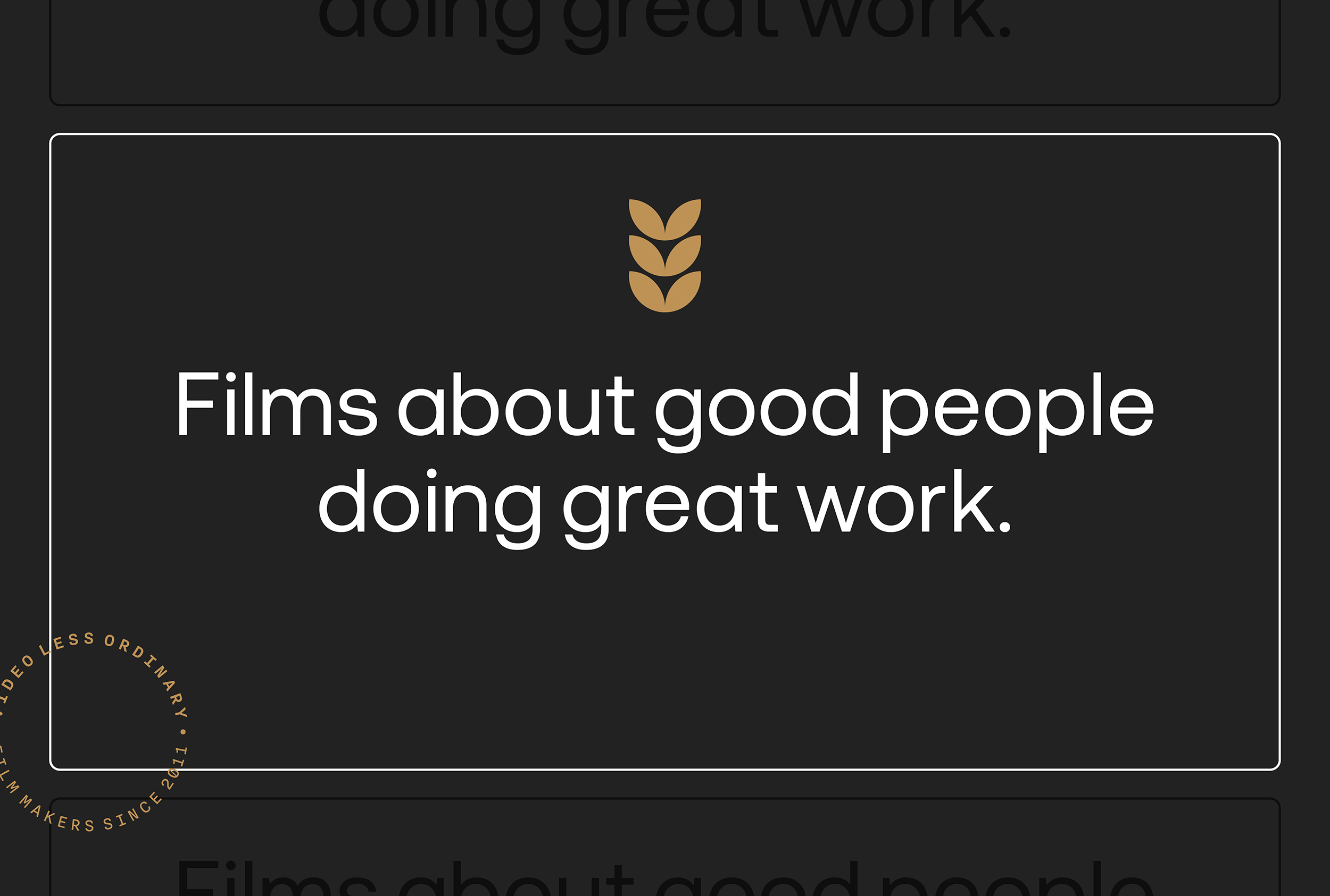
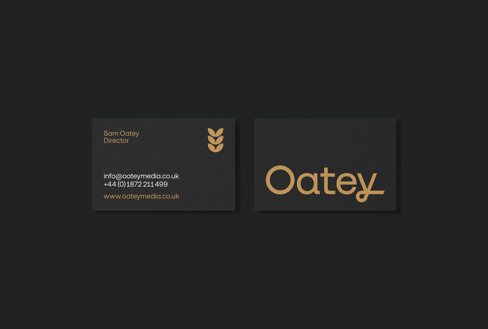
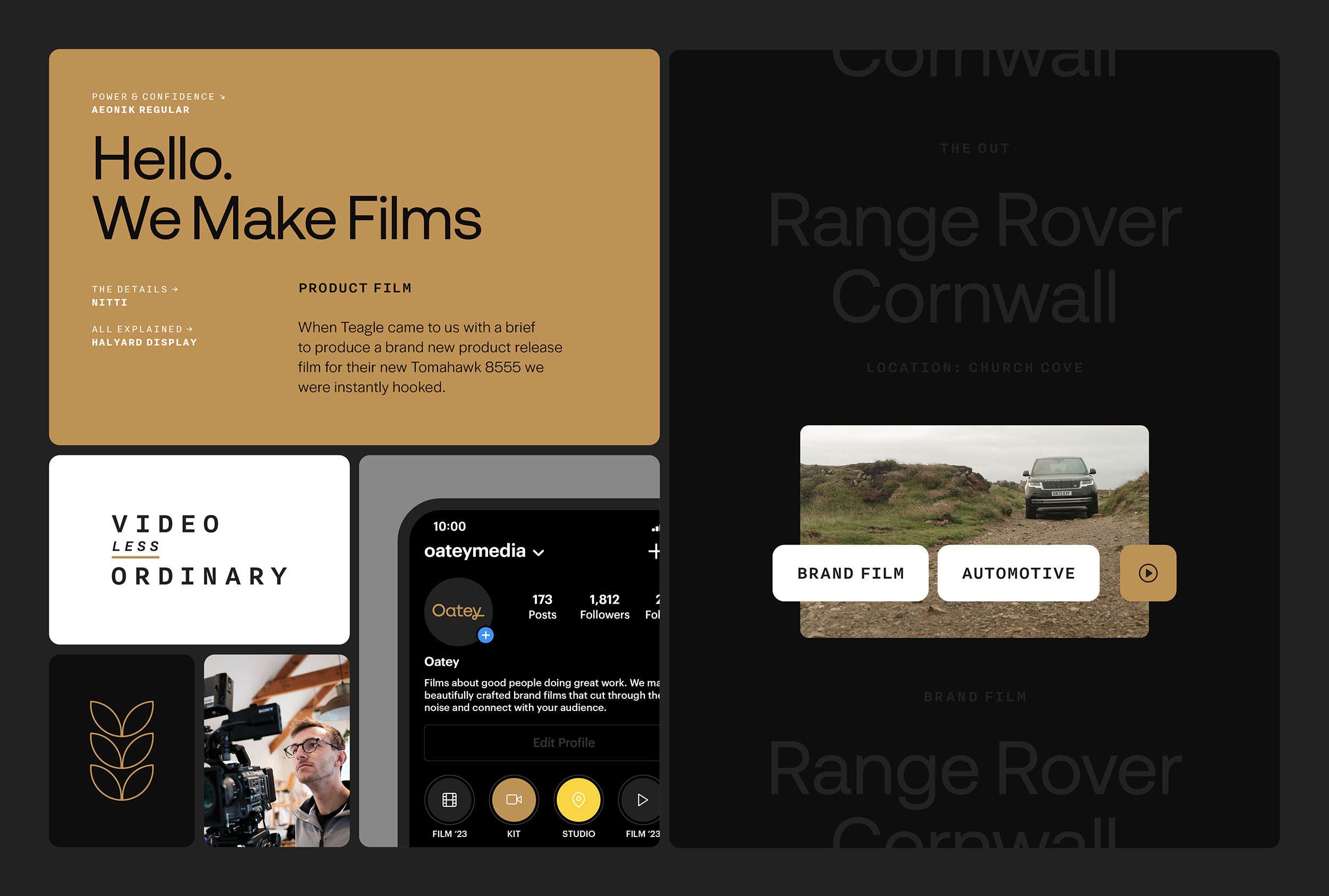
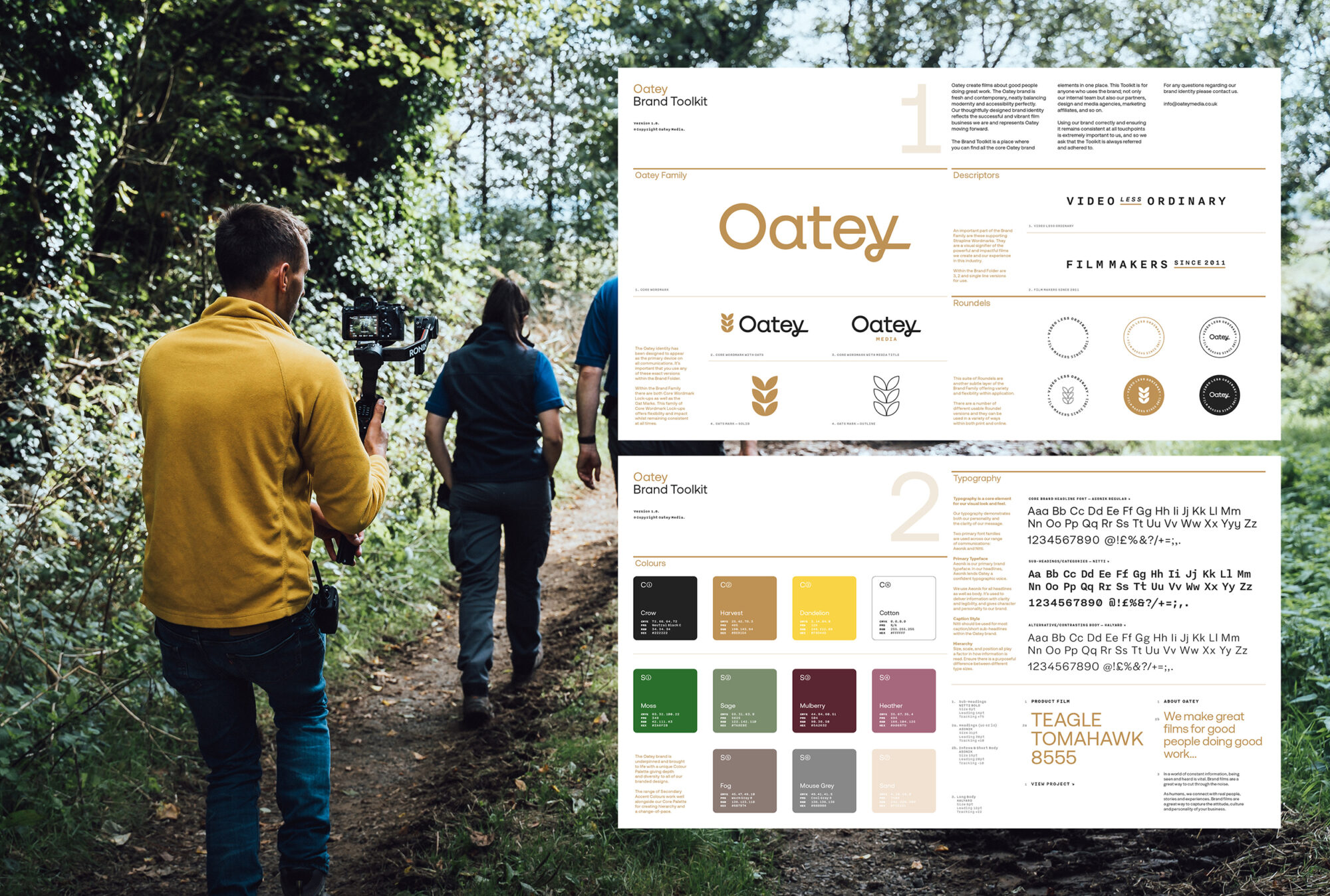
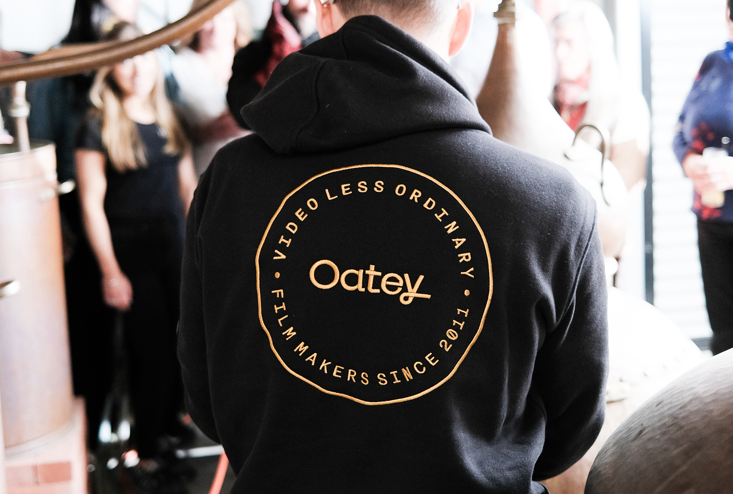
What emerged was a subtly luxurious identity, deeply rooted in authenticity, countryside allure, and a nod to British culture. After thoughtful discussions, the decision was made to retain ‘Media’ in tone while excluding it from the core brand representation.
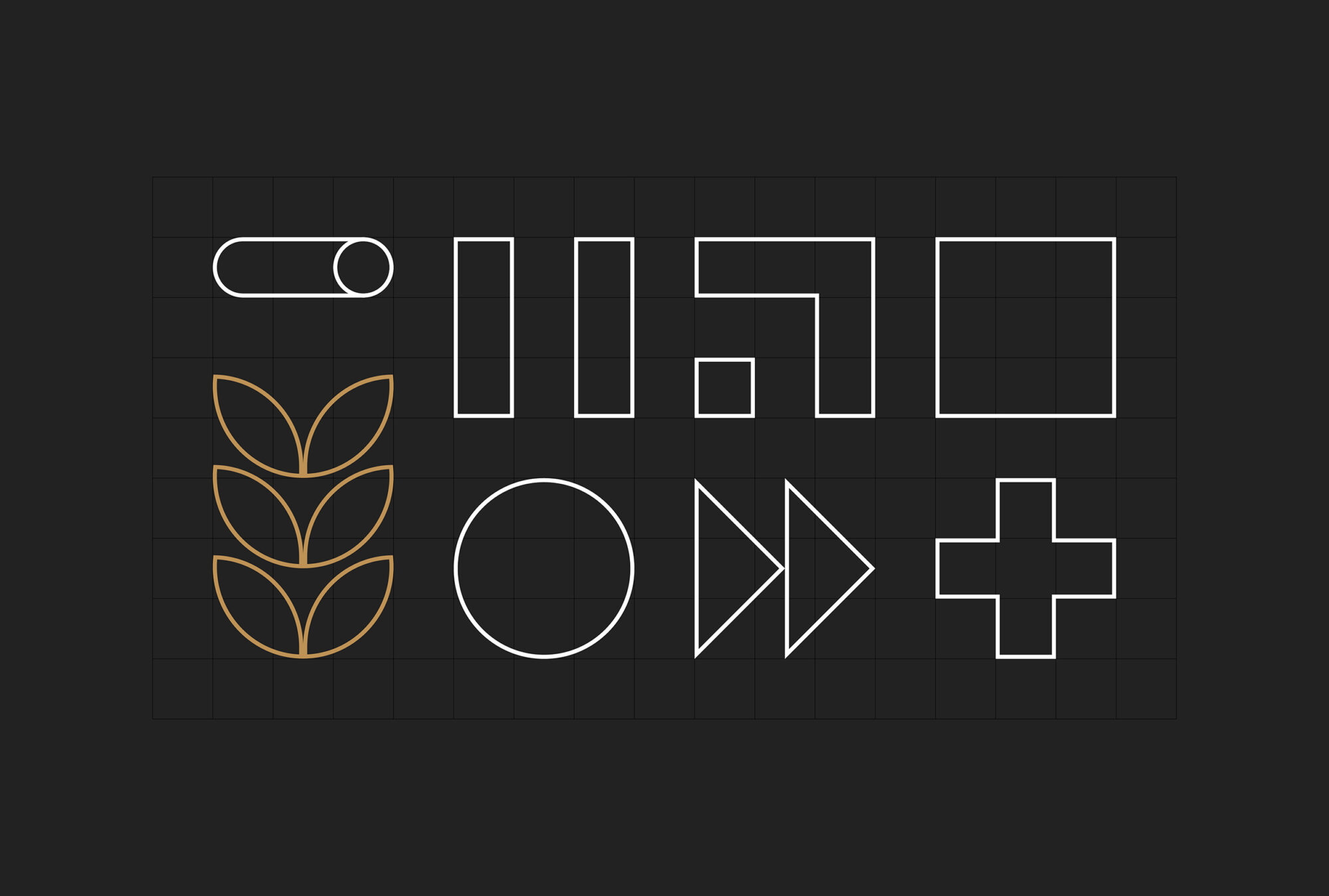
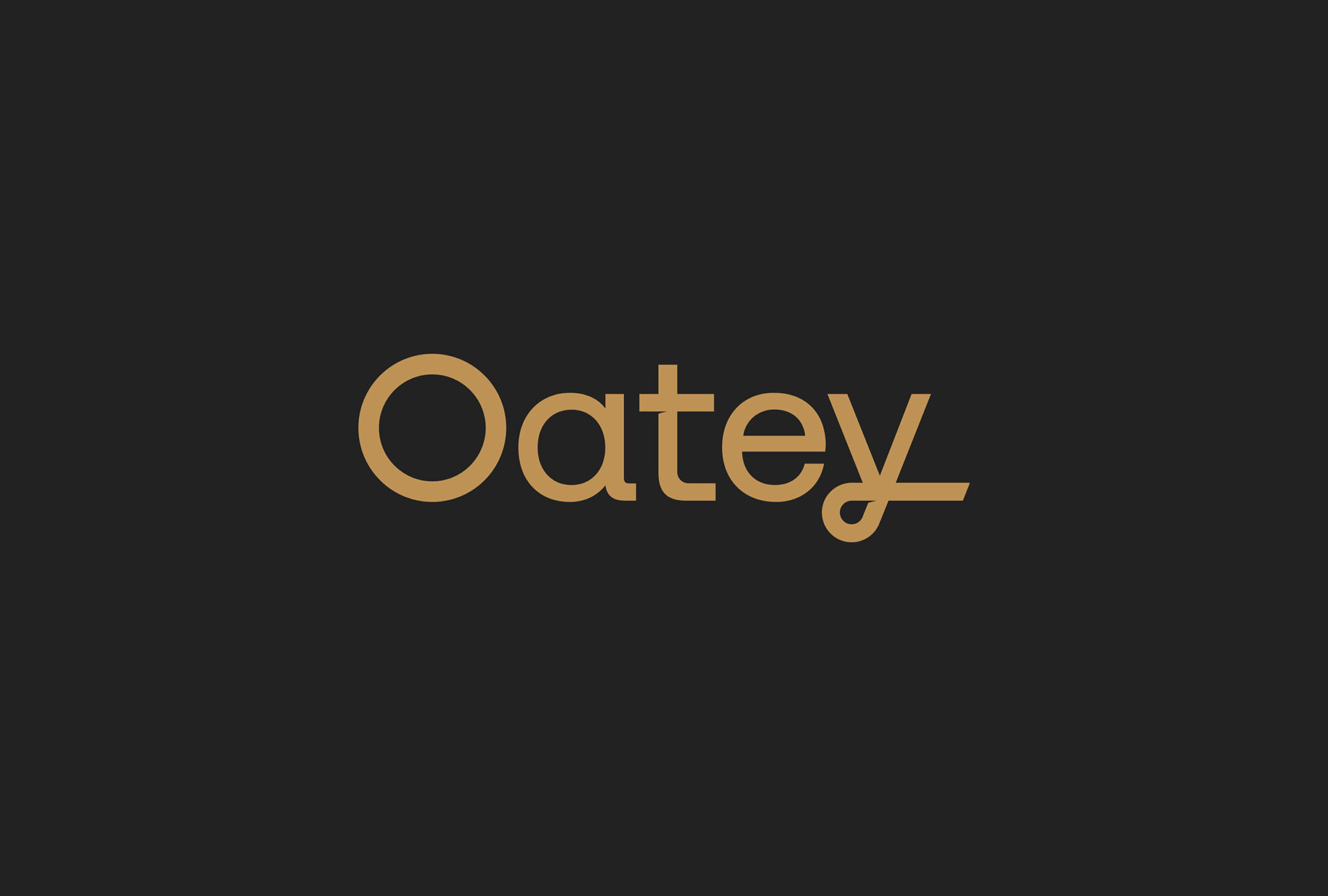
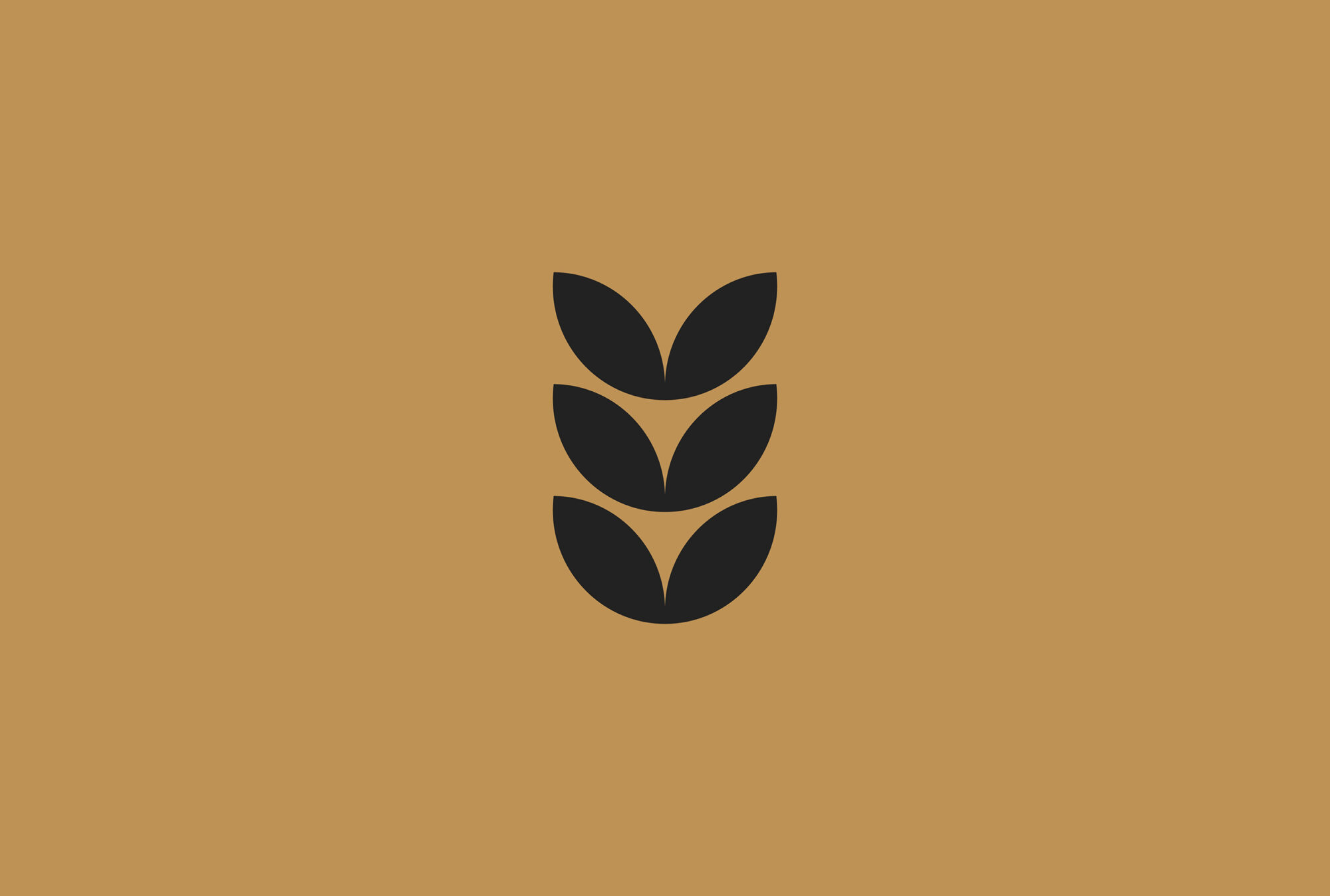
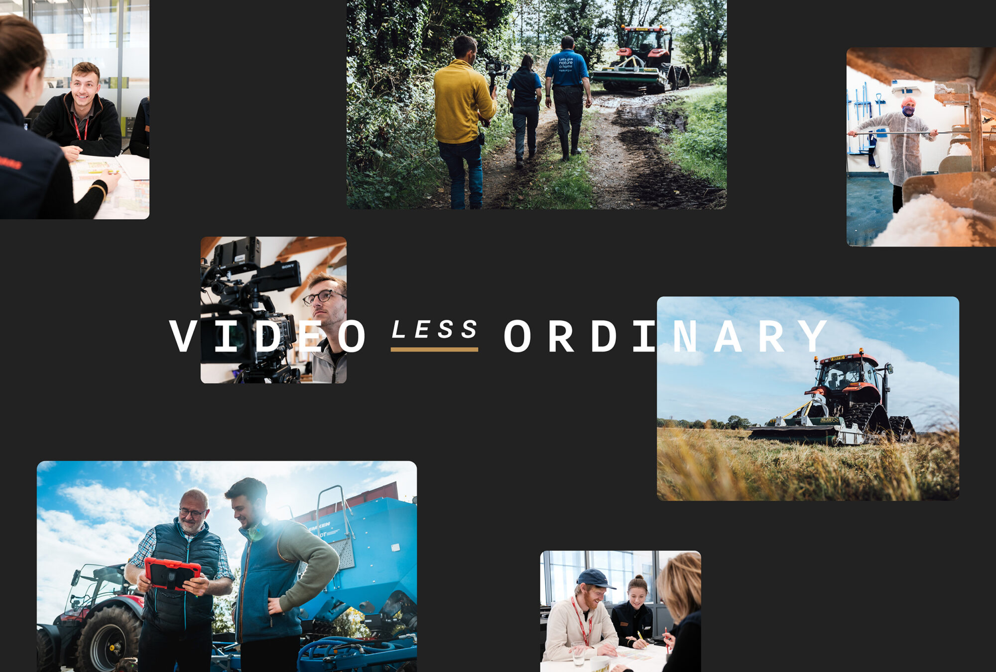
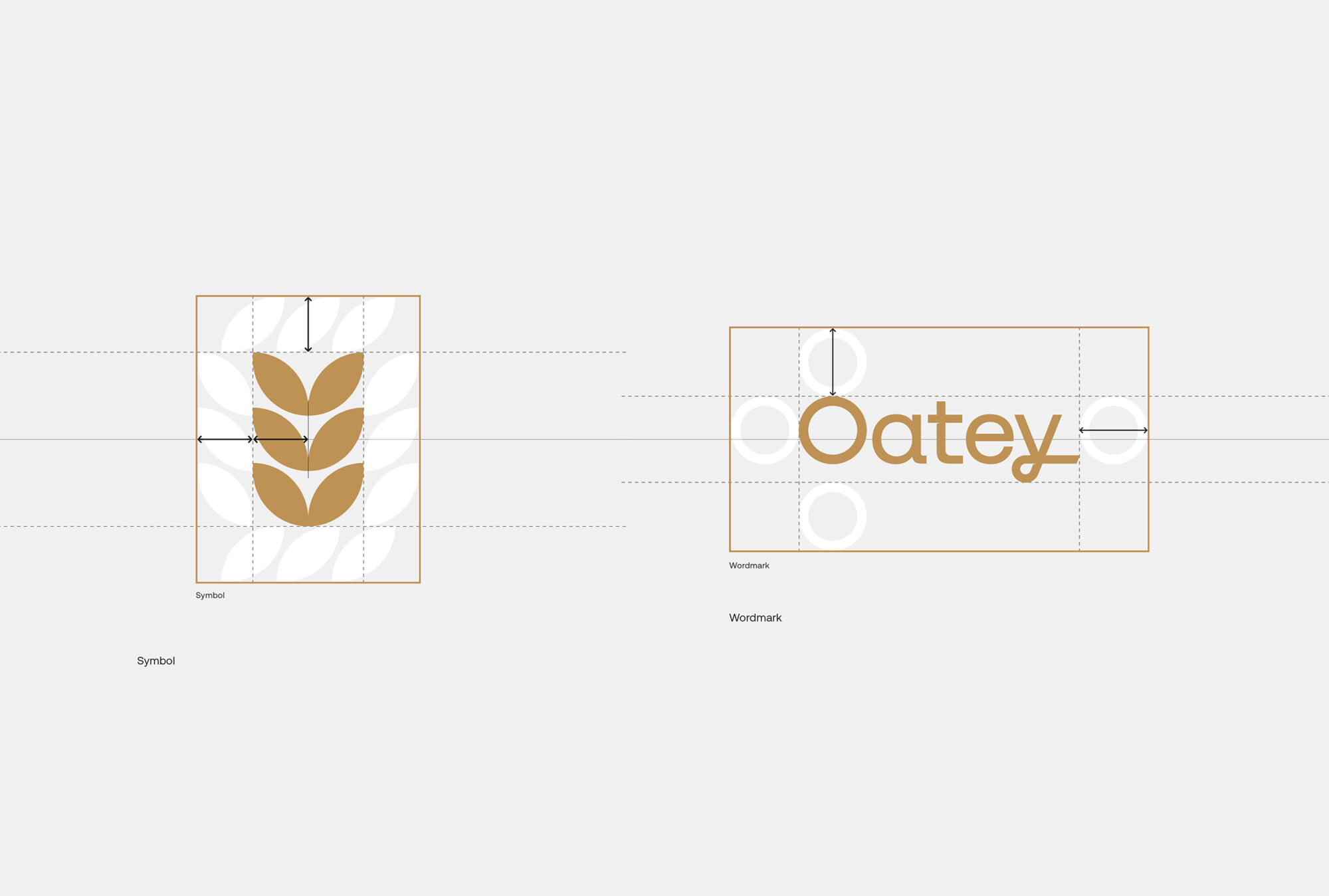
The wordmark embraces a modern classic style, with the extended tail of the ‘y’ resembling an old film reel, invoking motion and curiosity. An evolution of the original oat logo mark quietly brought forth a contemporary, abstract version. Descriptors created using the mono spaced Nitti font, pay homage to film strip details, invoking nostalgia, whilst circular roundels, echoing the ‘O’ from Oatey, continue to add layers of messaging to the overall identity.
A glorious colour palette, anchored by crow black and harvest gold, intertwined with rich mid-tones of mulberry and moss, create cohesion and marry the entire brand ensemble. At the heart of this rebrand lies a fusion of nostalgia and modernity, a nod to Oatey’s roots and their cinematic future.
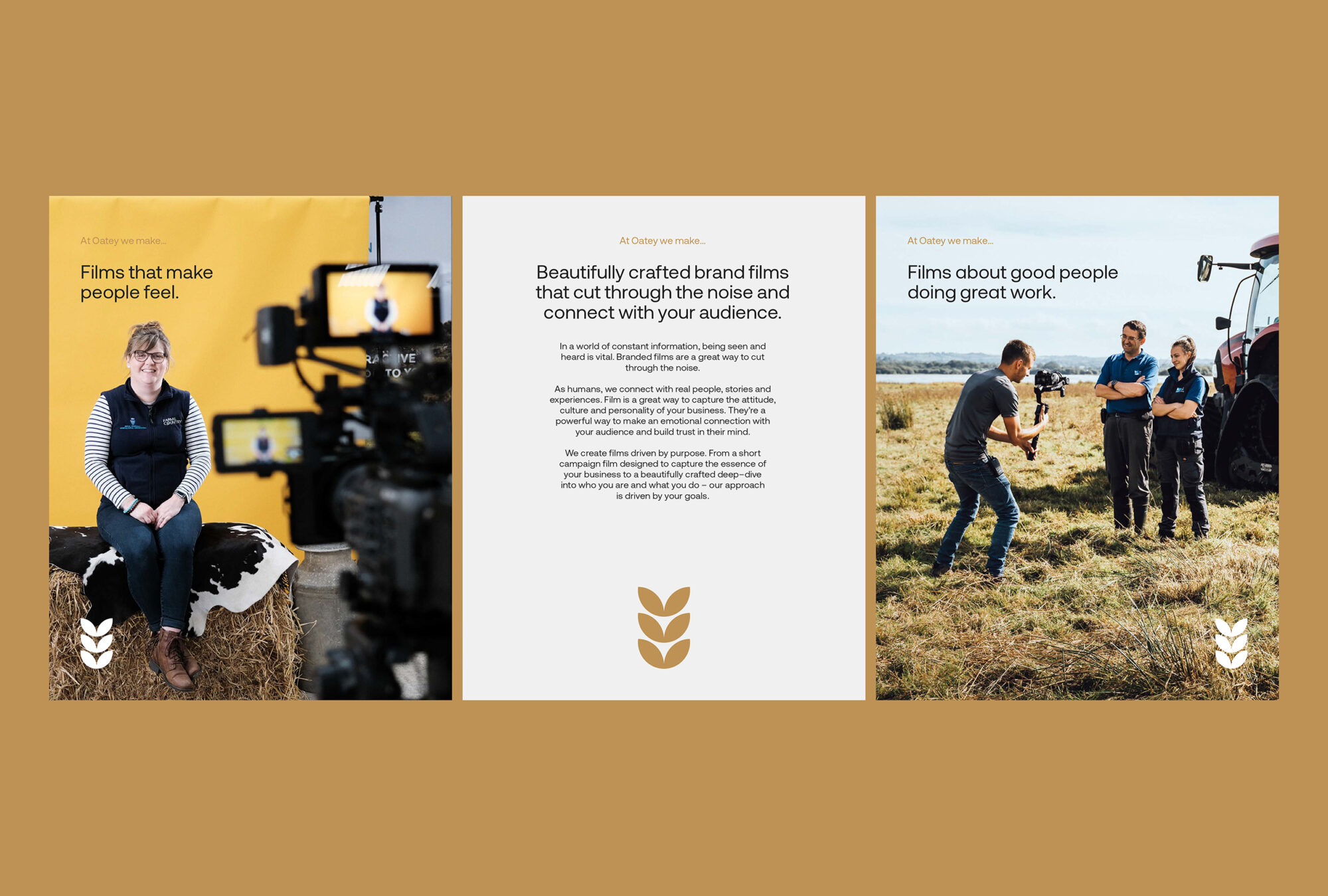
The journey of rebranding has been a joyous one for us. The new Oatey identity captures their business essence – a deep connection to the countryside, a hallmark of excellence. It exudes a persona that feels inquisitive, personal, and consistently impressive.
As they continue narrating stories of remarkable achievements, their brand stands as a testament to their unwavering creativity and dedication to crafting exceptional films about good people, doing great work.
For the past few years, we’ve seen Friends consistently deliver high-end projects. Their portfolio really shows their knack for turning brands into unforgettable experiences, and that's precisely what we were after.
Sam Oatey, Founder
Thanks to project partner.
Copywriting and Tone of Voice: Writing + Thinking